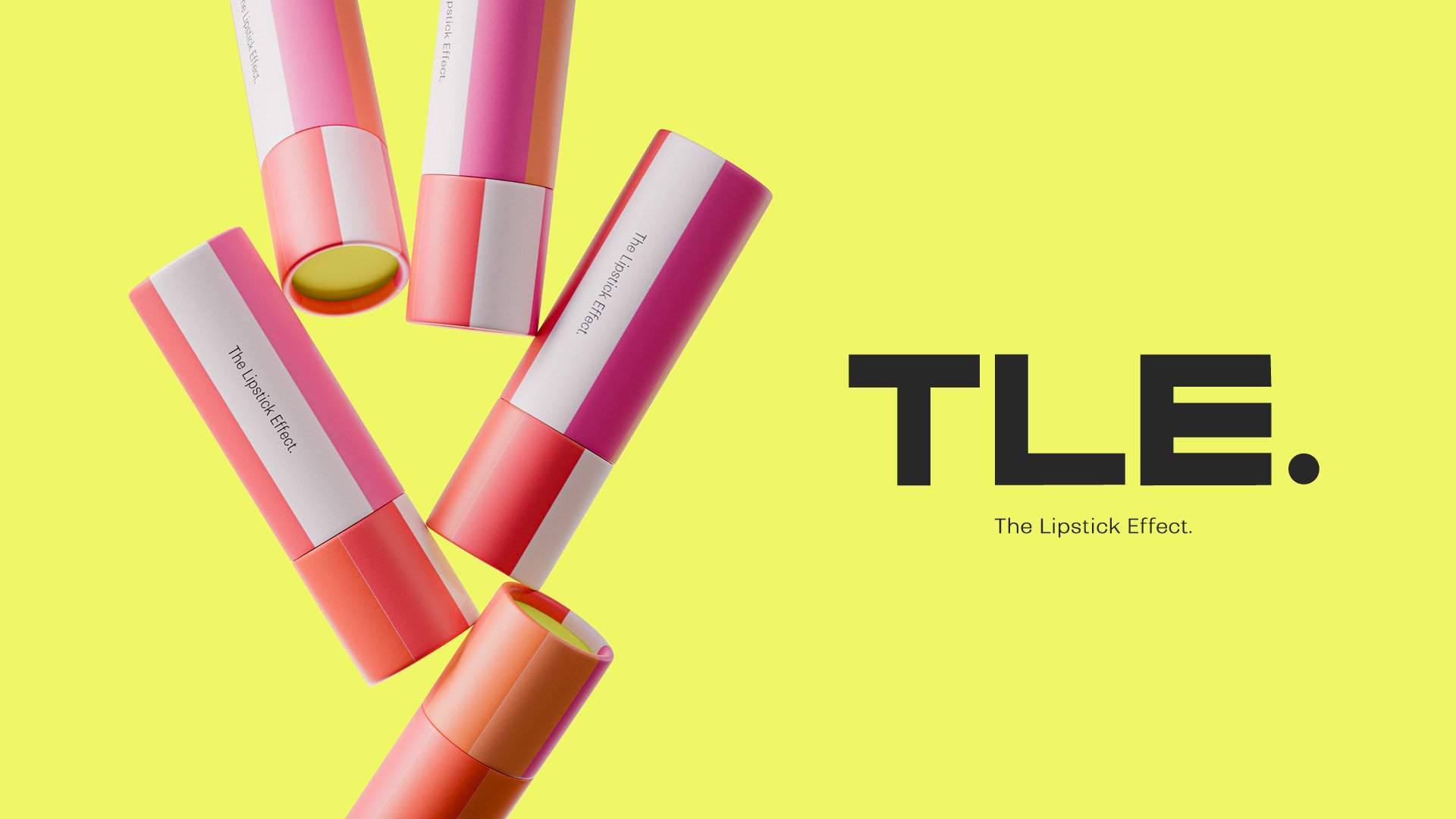
The lipstick effect.
BRAND IDENTITY
About.
Bold Colour. Big Conversations.
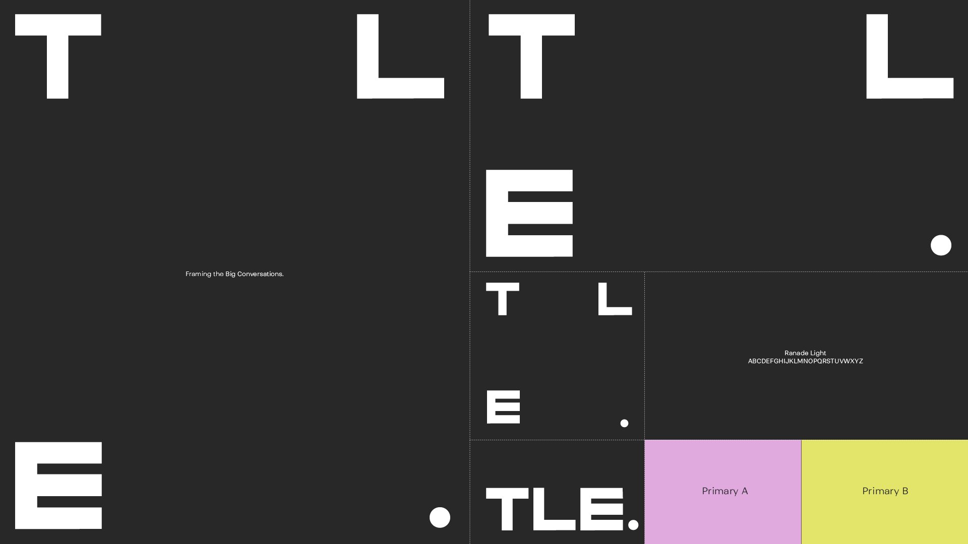
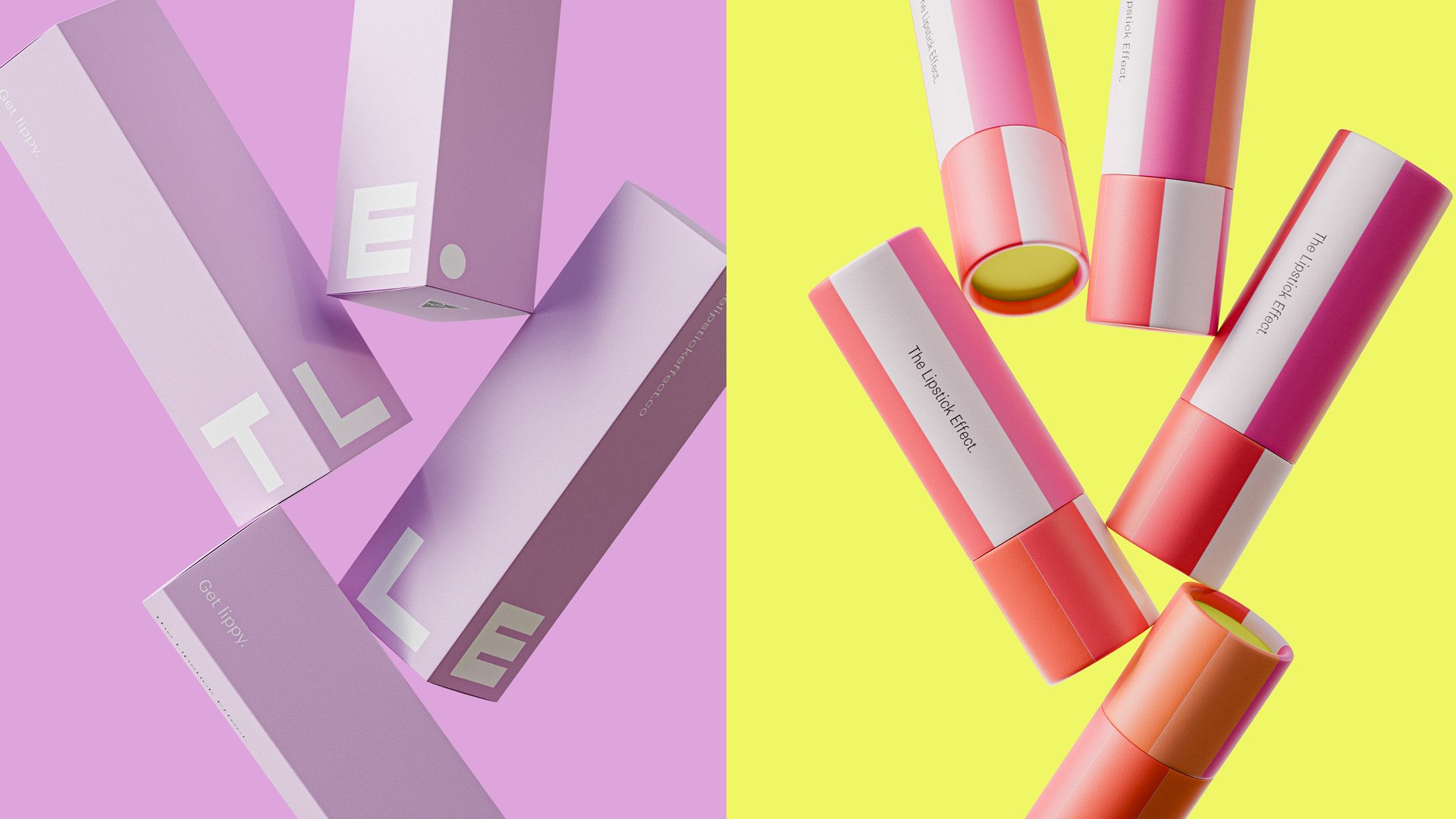
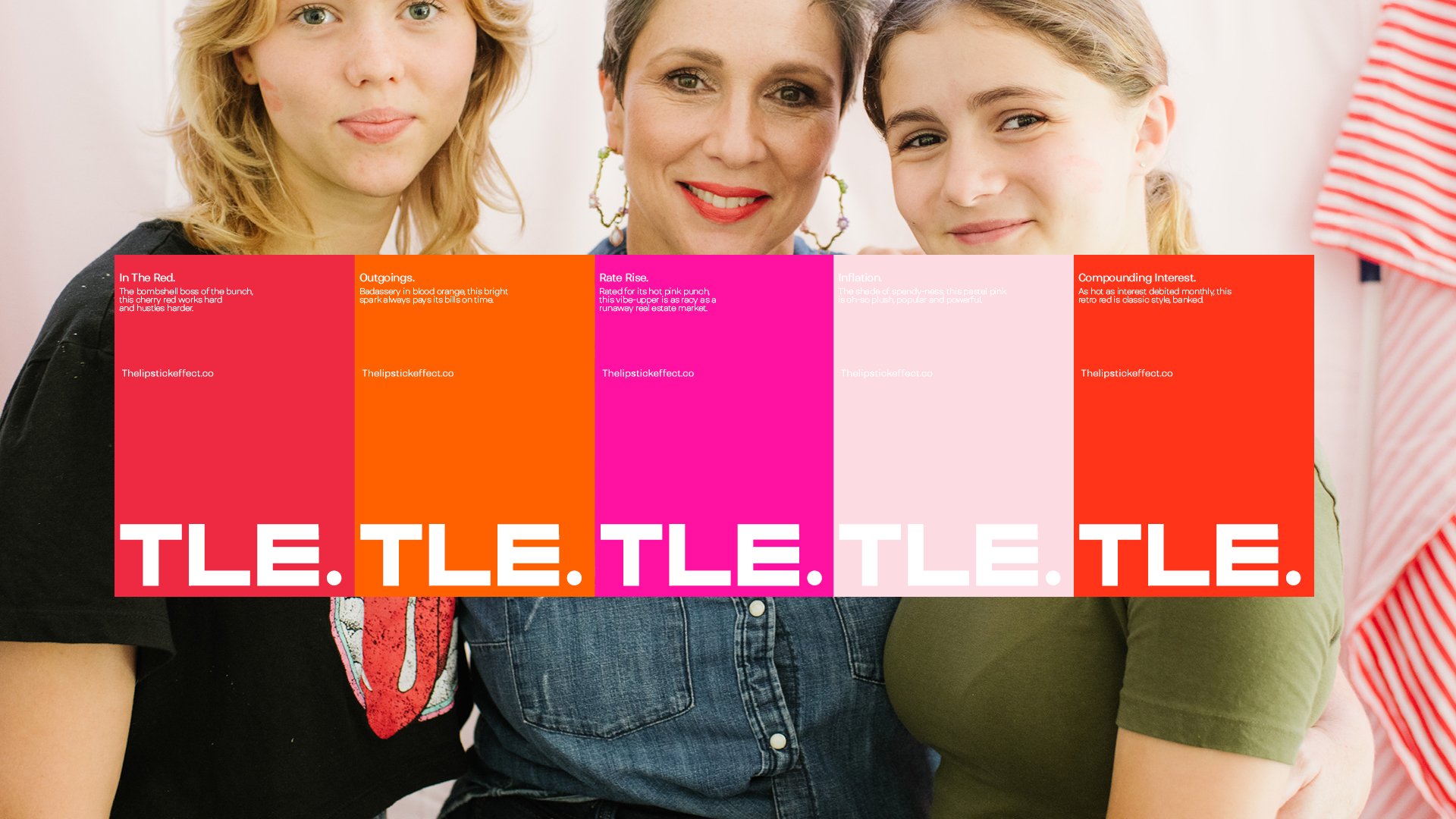
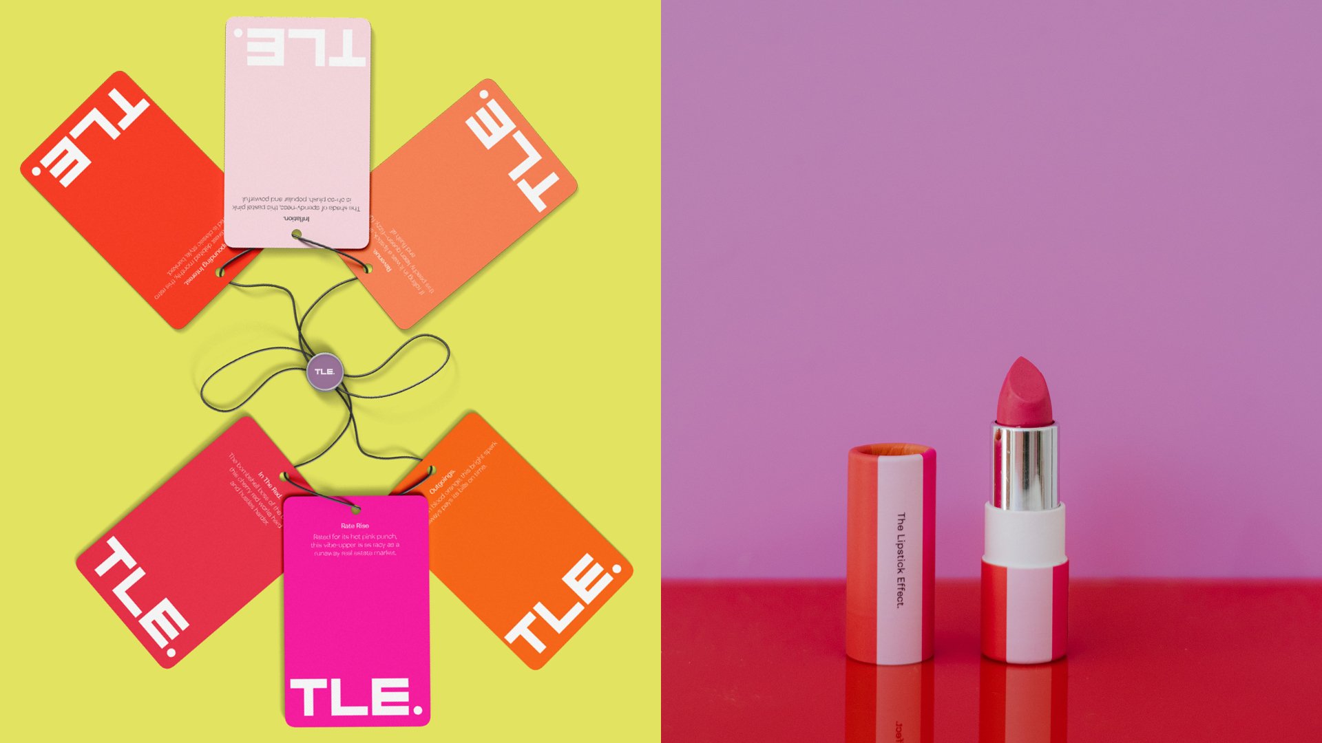
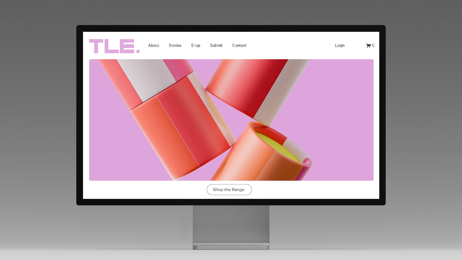
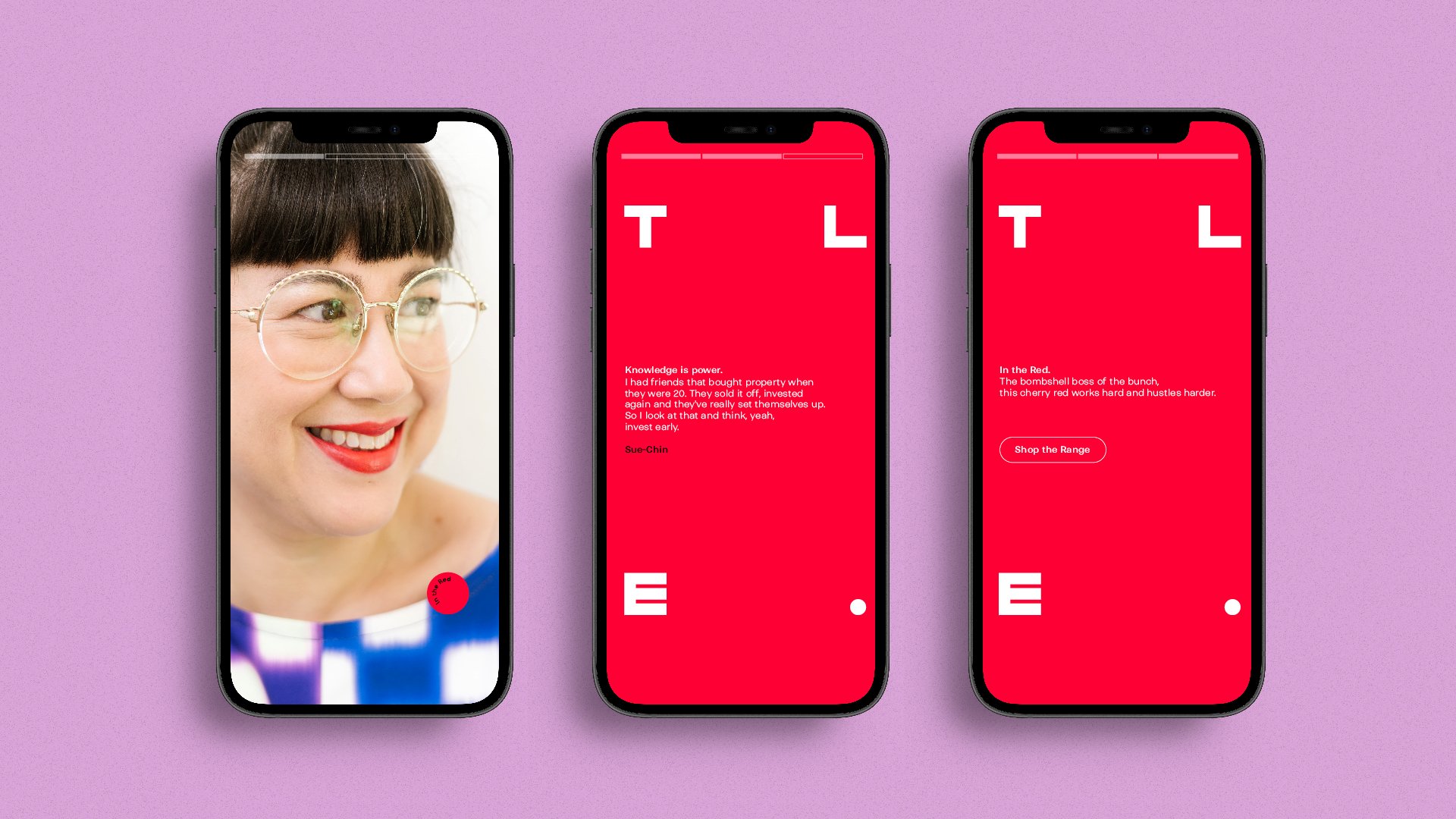
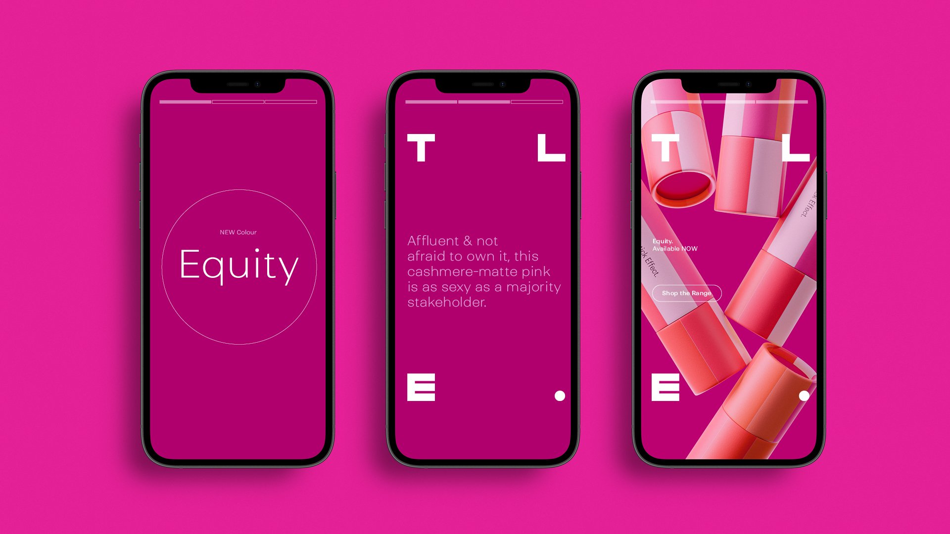
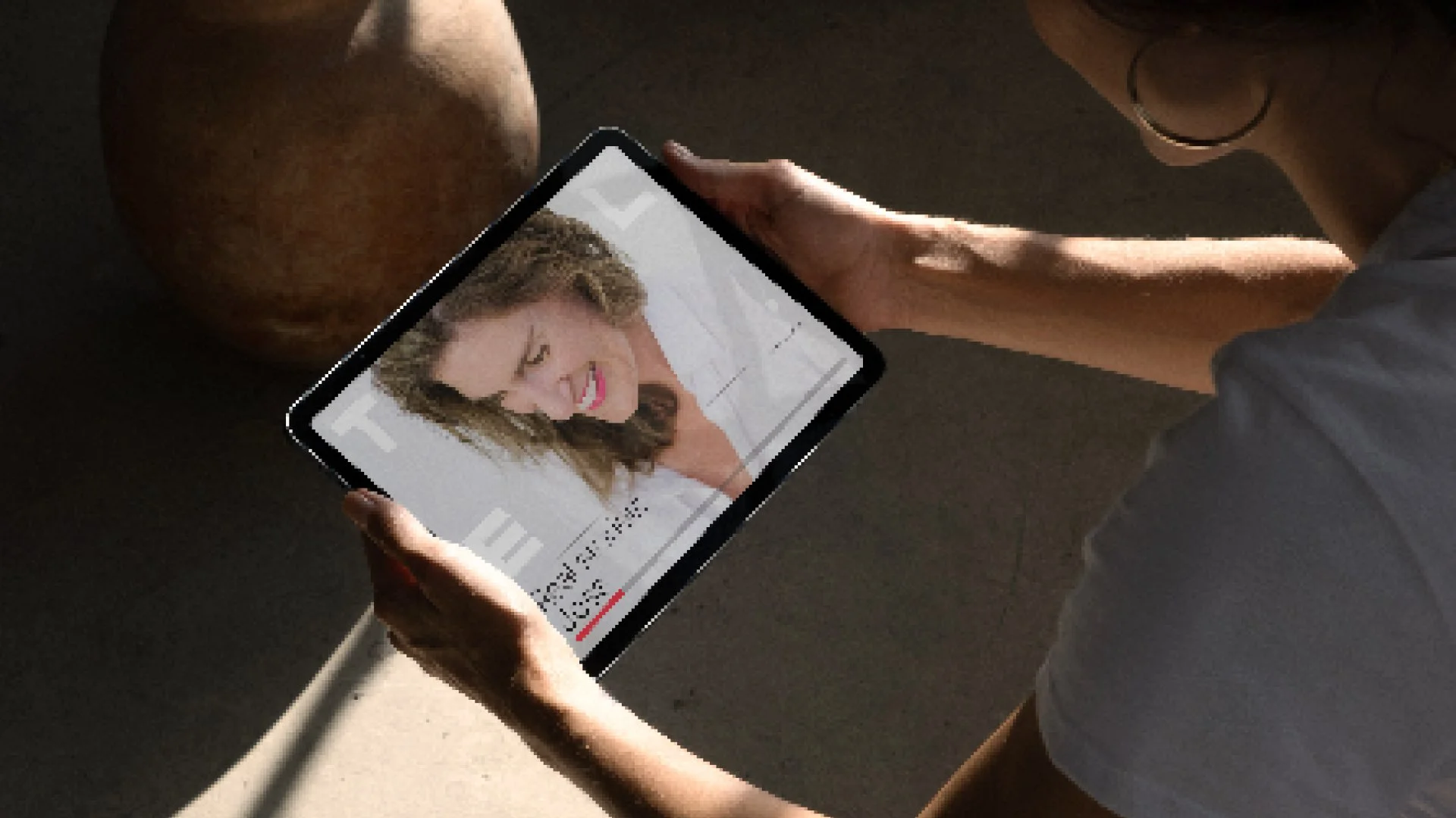
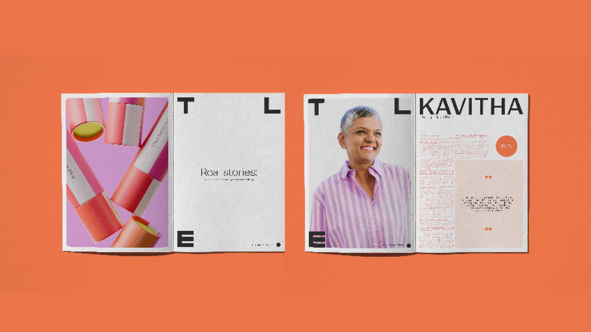
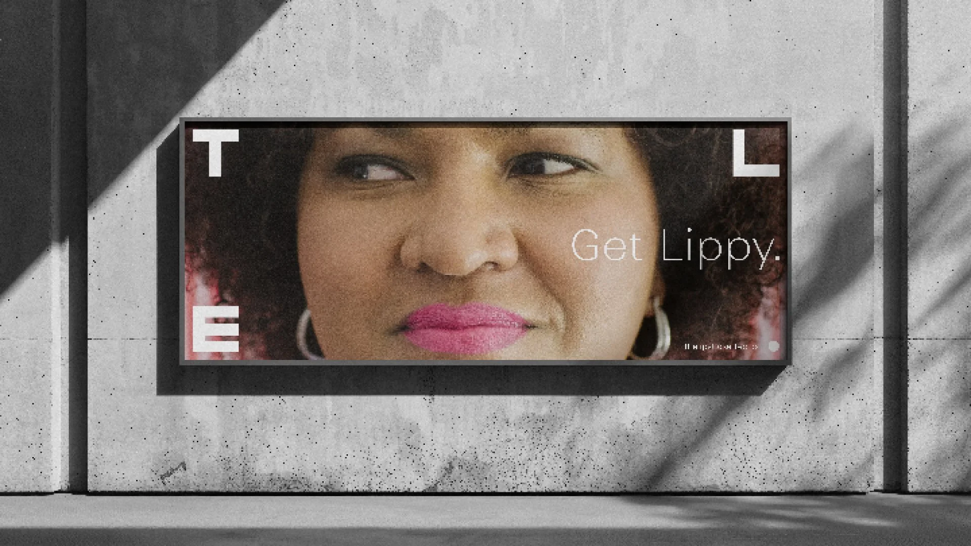
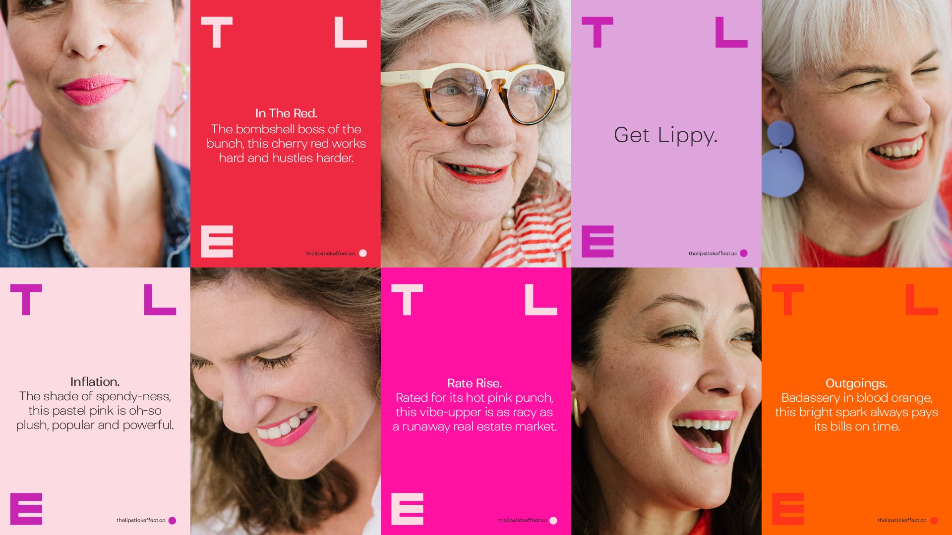
Inspired by financial graphs and a bold product colour palette, we constructed a geometric wordmark that leads as a word mark and flexes as a framing device, putting women at the heart of the brand. This versatile and adaptable device encompasses everything from packaging and print to digital and display — combined with an engaging and playful voice that resonated with the target market, while making it completely distinct within its category.
Team
—
Words: Claire Bartels
Photography: Lara Furst
